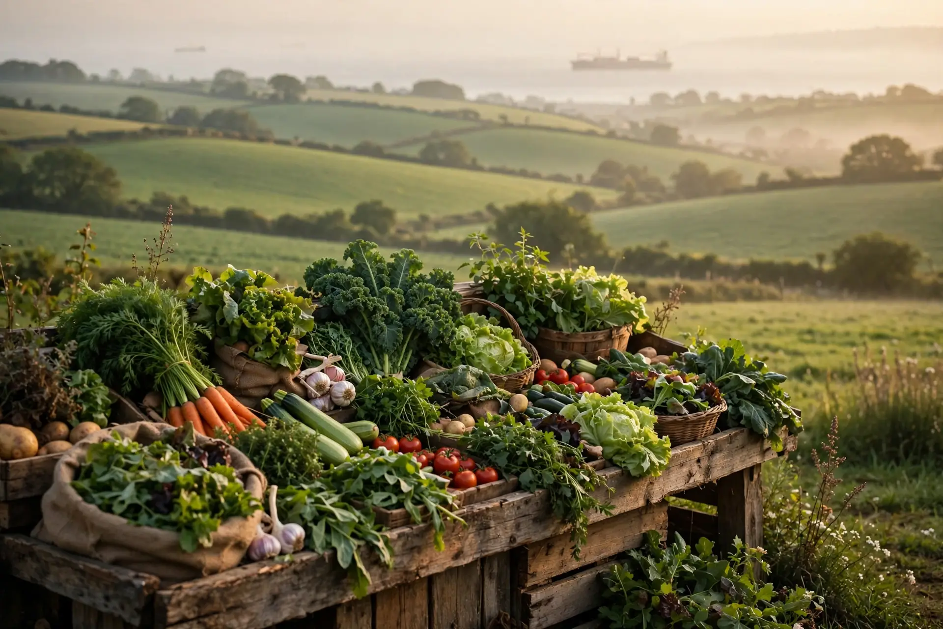
The Gospel of Food Miles
The farmers market runs on simple moral arithmetic: short distance equals small footprint. "Food miles" became the movement's favorite metric; the 100-mile diet turned proximity into a lifestyle.
The logic seems airtight. A cargo ship burning bunker fuel to move berries across an ocean must be worse than a pickup truck crossing the county. Distance is visible. Production is invisible: the fertilizer plant, the methane from a cow's digestion, the cleared forest. What you can see gets the blame.
What Two Engineers Added Up
In 2008, Christopher Weber and H. Scott Matthews of Carnegie Mellon stopped arguing from intuition and started adding. In Environmental Science & Technology, they fused a US input-output model with household spending data, tracing greenhouse gases from farm to retail for the average American household: 8.1 metric tons of CO2 equivalent per year. Food traveled far, 1,640 kilometers for final delivery and 6,760 across the full supply chain; the distances were real, and the question was whether they mattered.
Eighty-Three Percent vs Eleven Percent
Production dominated everything. Growing, raising, and processing food caused 83 percent of the household's food emissions, all transport combined caused 11 percent, and final delivery, the part "food miles" usually means, caused just 4 percent: production outweighed all transport combined by more than seven to one.
Gaps between foods dwarfed gaps between distances: red meat was about 150 percent more greenhouse-gas-intensive than chicken or fish, a difference large enough to swallow transport whole. The signature comparison still startles: shifting less than one day per week's calories from red meat and dairy to chicken, fish, eggs, or plants cuts more emissions than sourcing every calorie locally, and in driving terms, an all-local diet equaled about 1,000 fewer miles per year while one vegetarian day per week equaled about 1,160.
The papers never ran the national arithmetic. Analyses of the 2008 study put one red-meat-and-dairy-free day per week at about 0.3 tons of CO2 equivalent per household per year via chicken, fish, or eggs, and 0.46 tons via plants. Across the Census Bureau's 129.2 million US households, the 0.3-ton swap would cut roughly 38.8 million tons per year, about 8.4 million cars at the EPA's 4.6 tons per vehicle; full participation is unrealistic and every input is an average, so read it as scale, not precision.
The Largest Test Ever Run
A decade later, Joseph Poore of Oxford and Thomas Nemecek of Agroscope ran the largest test imaginable: a Science meta-analysis of 38,700 farms in 119 countries, covering 40 products behind about 90 percent of global protein and calorie consumption. It confirmed the 2008 finding and sharpened it, with impact varying up to 50-fold among producers of the same product, and the lowest-impact animal products still harming more than vegetable substitutes.
Meat and dairy deliver 18 percent of calories and 37 percent of protein, yet consume 83 percent of farmland and produce 60 percent of agriculture's greenhouse emissions. Without them, farmland could shrink by more than 75 percent, an area the size of the US, China, the EU, and Australia combined, and still feed the world. A 2019 erratum corrected details and the paper stands unretracted, though honest critics note the global medians may under-credit well-managed grazing and soil carbon in 2010-centered data. None of that overturns the core finding.
Both studies concede cases where distance wins: Spanish lettuce imported to Britain in winter produces three to eight times fewer emissions than locally grown, and Swedish greenhouse tomatoes used ten times the energy of in-season southern European imports.
The Strongest Counterargument
The strongest reply arrived in 2022, when Mengyu Li's team applied a global accounting framework across 74 countries and 37 sectors and found food transport systematically underestimated: 3.0 gigatons of CO2 equivalent per year, 19 percent of food-system emissions, three and a half to seven and a half times previous estimates. Part of the jump is definitional, since their "food miles" includes hauling fertilizer, pesticides, and farm machinery, not just food; under the conventional definition, Hannah Ritchie of Our World in Data calculates about 9 percent, closer to earlier work, and other researchers warn some freight assumptions may inflate the total. The sting is in the produce aisle: fruit and vegetable transport causes 36 percent of food-miles emissions, nearly twice the emissions of growing them, because refrigeration is carbon-expensive. The authors conclude that "a shift towards plant-based foods must be coupled with more locally produced items, mainly in affluent countries." For the lowest-footprint foods, miles are the footprint.
Further objections deserve weight: Weber and Matthews modeled the mid-2000s United States, and their split is an estimate, not a meter reading, and household averages hide the 50-fold variation Poore and Nemecek found. And "buy local" was never only about carbon: the papers measured greenhouse gases, not freshness, local economies, or resilience; if your market trip keeps money in the county, these studies have nothing to say against it.
The fair synthesis is narrower than either slogan: for meat and dairy, what you eat dominates where it traveled, and no update changed that; for fruit and vegetables, the 2022 paper genuinely rehabilitates the locavore, at least for affluent shoppers weighing imported refrigerated produce against local seasonal equivalents.
What We Didn't Prove
We did not prove buying local is pointless, only that its climate benefit is small next to diet shifts for the average household, though the 2022 update says it matters more than previously thought for produce.
We measured environmental damage, mostly climate: not nutrition, taste, farmworker welfare, local economies, biodiversity, or resilience, so a diet optimized on these numbers alone could fail on dimensions the papers never scored.
We did not test your household: averages describe populations, and a household already eating little meat has captured most of the diet-shift savings.
The Bottom Line
How food is produced causes the great majority of its climate footprint while moving it causes a small slice: across 38,700 farms in 119 countries, the lowest-impact meat still harms more than plants, and skipping red meat and dairy one day a week beats buying everything local. The honest update: for fruit and vegetables, especially refrigerated imports, transport can exceed the emissions of growing them, so put diet first, production method second, distance third, except in the produce aisle, where distance moves up the list.
What You Can Do
Declare one red-meat-and-dairy-free day per week, filling the gap with chicken, fish, eggs, or plants; analyses of the 2008 paper put the saving at 0.3 to 0.46 tons of CO2 equivalent per household per year.
Rank your food climate priorities in the order the evidence supports: what you eat first, how it was produced second, where it traveled third. When you eat beef, eat less of it rather than nearer beef.
Promote distance up the ranking in the produce aisle: favor local, seasonal fruit and vegetables, especially items likely flown or shipped refrigerated, like berries, asparagus, and out-of-season perishables.
Stop paying a green premium for "local" on the highest-footprint foods: a farmers-market steak is still a steak, so spend the premium where miles dominate the footprint.